Reference from IELTS WRITE RIGHT authored by Julian Charles
Summary
First of all, getting the WRITING TASK ONE, you need to analyse which kind of graphs it belongs to - line graph, pie chart, line graph and pie chart, table, table and pie chart, column graph, bar graph, diagram, flow chart or map. Overall, this part of writing task contains 10 sorts of graphs you ought to master.
Next, how to judge a composition whether it's good or bad? It follows by four rules:
- Task Achievement
- Coherence and Cohesion
- Lexical Resources
- Grammatical Range and Accuracy
What Task Achievement means? It's simple to answer it with a word 'Topic'. Whatever kind of charts, firstly you should tell readers what the graphs in the task are mainly talking about, giving a general idea that you introduce next. Then you need to analyse charts or/and graph in a clear and logical way in a specific sequence. Most importantly, each paragraph is supposed to have a topic sentence to express your main idea, and directly let your point of view in the prominent position.
What's more, when we come to the coherence and cohesion between sentences or between paragraphs , it's significant to realise the wise use of connective words or phrases like 'then', 'moreover', 'however', 'meanwhile' ,etc. However, the most intelligent method is to connect two parts in a logical way like using synonym or near-synonym expression of key words in the last sentence/paragraph. And for Lexical Resources / Grammatical Range and Accuracy, I'll combine some Model Compositions to explain how to achieve the Band 7+.
The last thing is to summary the charts and/or graphs. Remember to be simple and in some cases this section can be omitted.
Reference
Following are some reference written by experienced examiners which are having a band of 7+.
1. Line Graph(Birth rates in China and the USA)
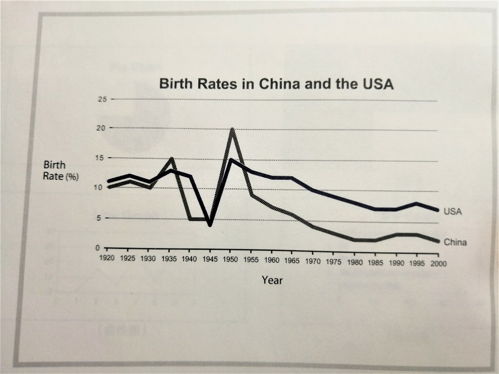
A glance at the graph provided reveals some striking similarities between the Chinese and US birth rated during the period from 1920 to 2000. It is evident that both nations saw considerable fluctuations in fertility, with low during 1940s and highs in 1950s.
Increasing from approximately 10 percent in 1920 to 15 percent in 1935, China’s birth rate then plunged to a low of just 5 percent in the 1940s. This was followed by a period of exponential growth, with fertility in the country reaching a peak of 20 percent in 1950. The latter half of the century, however, brought a sustained decline in this figure.
The US birth rate, meanwhile, fluctuated at somewhere between 11 and 13 percent prior to 1940, before dropping sharply to less than 5 percent in 1945. The following 5 years saw a rapid climb in this rate, to somewhere in the vicinity of 15 percent in 1950, followed by a steady fall.
It is interesting to note that while the birth rates of both countries were comparable until 1950, the gap between the two widened after this time as fertility in China slid away.
In this model answer we can learn:
some expressions as follows
- A glance at the graph provided reveals ...
- It's interesting to notice that ...
- It is evident that ...
- (A period) saw a rapid climb in this rate, to somewhere in the vicinity of ..., followed by ...
some words and phases
- considerable fluctuations / sth. fluctuate
- approximately instead of about / around
- striking similarities/differences between A and B
- during the period from ... to ...
- sustained decline
- reach a peak of ...
- prior to instead of before
- flucuted at somewhere instead of 'fluctuated at around'
- rapid climb
- to somewhere in the victinity of
- followed by
- the gap between the two widened / narrowed(vt.)
- fertility instead of 'birth rate'
- plunge / slide away instead of 'fall sharply' or 'decrease dramatically'
- reveal is more advanced than show
- decline is more advanced than decrease / drop / fall
2. Line Graph and Pie Chart(Crime in the UK)
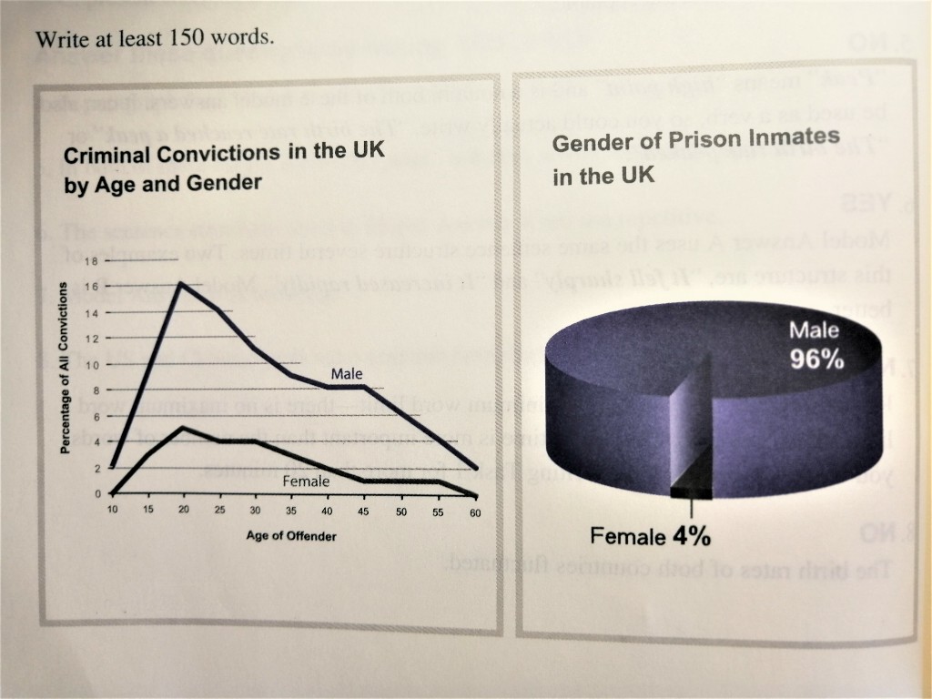
Given are two figures concerning criminality in Britain. The first provides data on the rates of conviction among men and women of various ages, while the second indicates the gender balance of the UK prison population.
It is apparent from the information supplied that the rate of conviction among Brits of both sexes increases exponentially during adolescence and peaks at the age of about 20. Also evident is the fact that men are far more likely to offend than women. From a negligible 2 percent among 10-year-old boys, the male conviction rate soars to approximately 16 percent among 20-year-olds. The percentage of female offenders, meanwhile, climbs from 0 percent among girls of 10 to some 5 percent for 20-year-olds. The subsequent decades, however, see dramatic decreases in criminality among both sexes. A mere 2 percent of crimes are committed by 60-year-old men and 0 percent by women of the same age.
As for the proportion of male and female prison inmates, men outnumber women 24 to 1. Some 96 percent of all prisoners are men, while the remainder are female.
In this model answer we can learn:
some expressions as follows
- It's apprarent from the information supplied that ...
- Given are two figures concerning ... The fisrt provides data on .... while the second indicates ...
- the subsequent decades, however
some words and phrases
- exponential instead of dramatic / sharp (increase exponentially)
- adolescence
- negligible instead of only / just (tip: better use in case of lower than 5)
- offender / convicted criminal / prison inmate instead of prisoner
- apparent / evident instead of clear
- increase exponentially / soar instead of increase dramatically
Other thinking for supplement
- nevertheless instead of however
- hence(adv.) / thus(adv. conj.) instead of therefore
3. Pie Chart(Leisure Activities in Europe)

A glance at the two pie charts provided reveals the relative popularity of various leisure activities among European adults in 1989 and 1995.
Of these activities, watching television was the most widely enjoyed in both years, at 32 percent in 1989 and a slightly lower 30 percent in 1995. Yet, by far the most significant change to take place during this period was the increased popularity of computer games. Not a single respondent to the survey rated playing computer games as their preferred leisure activity in 1985. However, by 1995 this figure stood at 27 percent - the second highest overall. Also more popular in 1995 was talking with friends, at 26 percent compared to 21 percent a decade earlier.
In stark contrast, however, all other activities decreased in popularity. Eating out - which was the second most widely enjoyed pastime in 1985, accounting for 23 percent of respondents - slipped to a mere 8 percent in 1995. Likewise, there were also considerable decreases in the popularity ratings of talking with family, other activities and (as previously mentioned) watching television.
4. Table and Pie Chart(Internet Use in Europe)
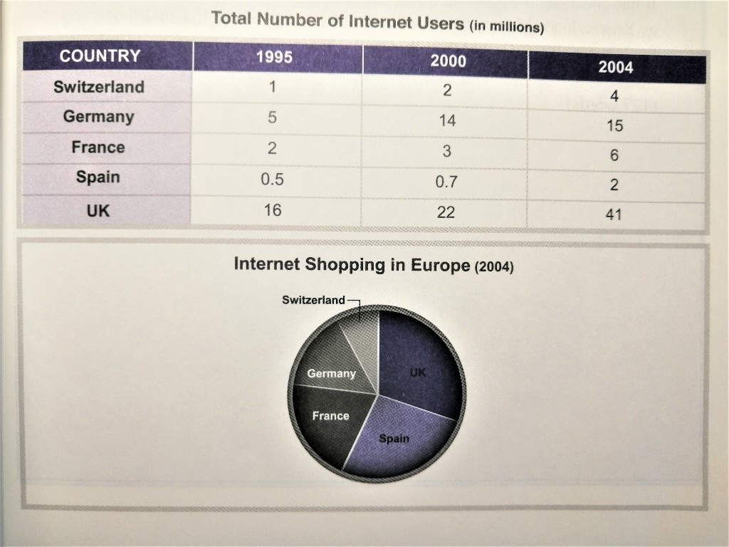
Given are two figures providing a comparision of internet use in five Europe countries (namely Switzerland, Germany, France, Spain and the UK) in 1995, 2000 and 2004, as well as the popularity of internet shopping in these countries.
It's evident from the information provided that Britain had by far the highest number of internet users in all three years. From 16 million in 1995, the number of British users climbed steadily to 22 million in 2000, before soaring to a staggering 41 million in 2004. Second in terms of internet use was Germany. This country saw a threefold increase during the period in question, from 5 million people in 1955 to 14 million in 2000 and 15 million in 2004. A similar increase took place in France. The two nations with the fewest internet users, meanwhile, was Switzerland and Spain.
It is also interesting to note that internet shopping was far more common in the UK than any other country listed. In fact, the prevalence of internet shopping in Britain was double that of Germany adn triple that of Switzerland. France and Spain, meanwhile, had moderate levels of online shopping.
Leaning some excellent expressions from the above:
- by far = especially (it also has the meaning of 'up to now')
5. Table(World Metro Systems)
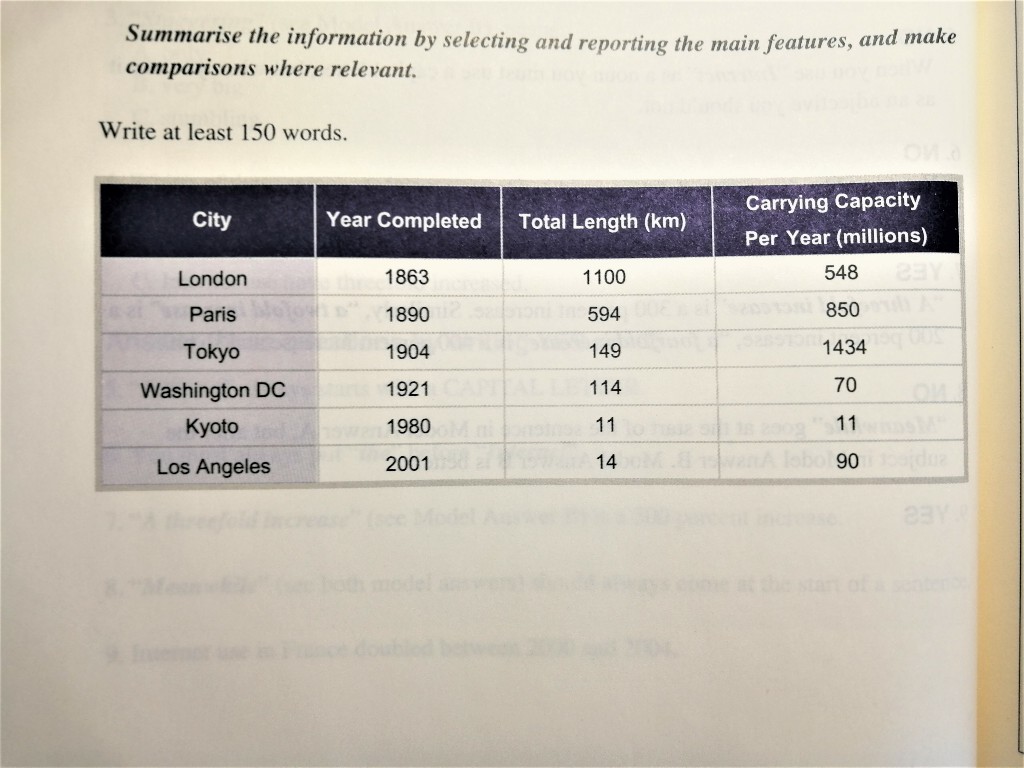
A glance at the table provided reveals a number of clear differences between the major metro system of the world in terms of age, scale and annual carrying capacity.
One particularly interesting fact highlighted by the figure is that the more recently established metro systems are considerably shorter than the older ones. Completed in 1863, the London underground is the oldest of the metro systems listed and also the longest, extending for 1100 kilometres. Likewise, the second oldest system is also the second longest: built in 1890, the Paris metro is some 594 kilometres in length. In stark contrast, however, the Kyoto and Los Angeles metro systems - established in 1980 and 2001 respectively - are far shorter. The former covers a mere 11 kilometres and the latter just 14 kilometres.
With regard to yearly carrying capacity, the metro systems mentioned in the table vary greatly. The Tokyo metro is equipped to carry the largest number of passengers, at 1434 million. With 850 million, meanwhile, the Paris metro has the second largest carrying capacity. The systems with the smallest capacities are those of Kyoto and Washington DC, transporting just 11 million and 70 million people per year respectively.
Leaning some excellent expressions from the above:
- A kind of linking last sentence expression - With ... , meanwhile, ... has/is/does ...
- in terms of
- One particularly interesting fact highlighted by the figure is that ...
- considerably instead of much
- The former ..., the latter ...
- In stark contrast (having oppsite meaning)
- With regard to ..., ... mentioned in the table/chart/graph + v.
6. Column Graph(Global Education Rates)
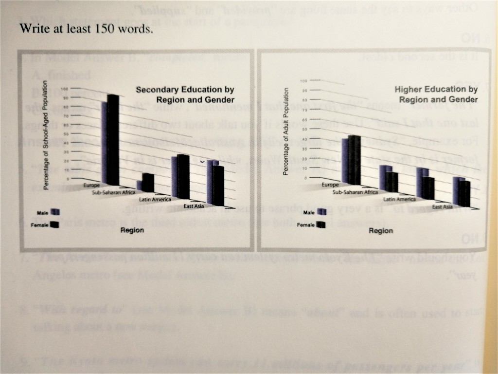
Given are two column graphs comparing the rates of secondary and tertiary education among males and females in various different parts of the world.
While Europe enjoys relatively high levels of education overall, it seems that people in less affluent regions are far less likely to be educated. All European girls of school age and 90 percent of boys receive a secondary education, compared with only 20 percent of girls and 10 percent of boys in Sub-Saharan Africa. Latin America and East Asia, meanwhile, have moderate levels of secondary education - between 40 percent and 50 percent for both sexes.
With ragard to higher education, the figures are much lower throughout the world. In Europe, some 50 percent of adult females and 45 percent of adult males gain a higher education. Conversely, only 20 percent of females and 25 percent of males in Sub-Saharan Africa attend college or university. The figures for Latin America and East Asia are marginally higher than those of Africa.
Also noteworthy is the fact that females are more likely to receive a secondary education in all regions except East Asia, but less likely to receive a tertiary education in all regions except Europe.
7. Bar Graph (Plastic Surgery in South Korea)
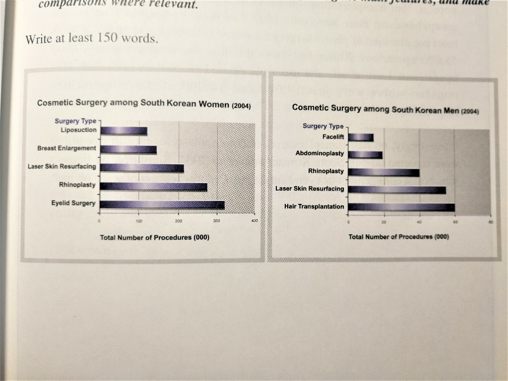
*plastic surgery = cosmetic surgery
A glance at the two figures provided reveals the popularity of various forms of cosmetic surgery among South Korean men and women in 2004.
Not surprisingly, plastic surgery enjoyed widespread popularity among women. By far the most common forms of cosmetic procedure for this group, eyelid surgery and rhinoplasty were performed a staggering 320,000 and 275,000 times respectively. Third in terms of popularity, meanwhile, was laser skin resurfacing. An approximate 215,000 of these procedures were conducted on women during the year in question. Breast enlargement and liposuction were considerably less common, at 145,000 and 120,000 operations respectively.
Equally predictable is the fact that plastic surgery was far less popular among men. In contrast to women, hair transplantation was the most common cosmetic procedure. There were just 60,000 of these operations among South Korean males. Numbering some 55,000 procedures, laser skin resurfacing was second for this group. Third was rhinoplasty, at approximately 40,000 operations. Finally, a relatively small 19,000 abdominoplasty and 14,000 facelift procedures were carried out on men during 2004.
It's interesting to note that hair transplantation, abdominoplasty and facelift patients were exclusively male, while 100 percent of liposuction, breast enlargement and eyelid surgery patients were female.
From the above we can learn:
Flexible way to express times of operation, for instance,
- ... be performed (num.) times
- An approxiamte (num.) of these procedures were conducted ...
- at (num.) operations
We can find that in the last paragraph the author choose the different features in men and women plastic surgery to write, which is worth learning.
8. Diagram (River Pollution)
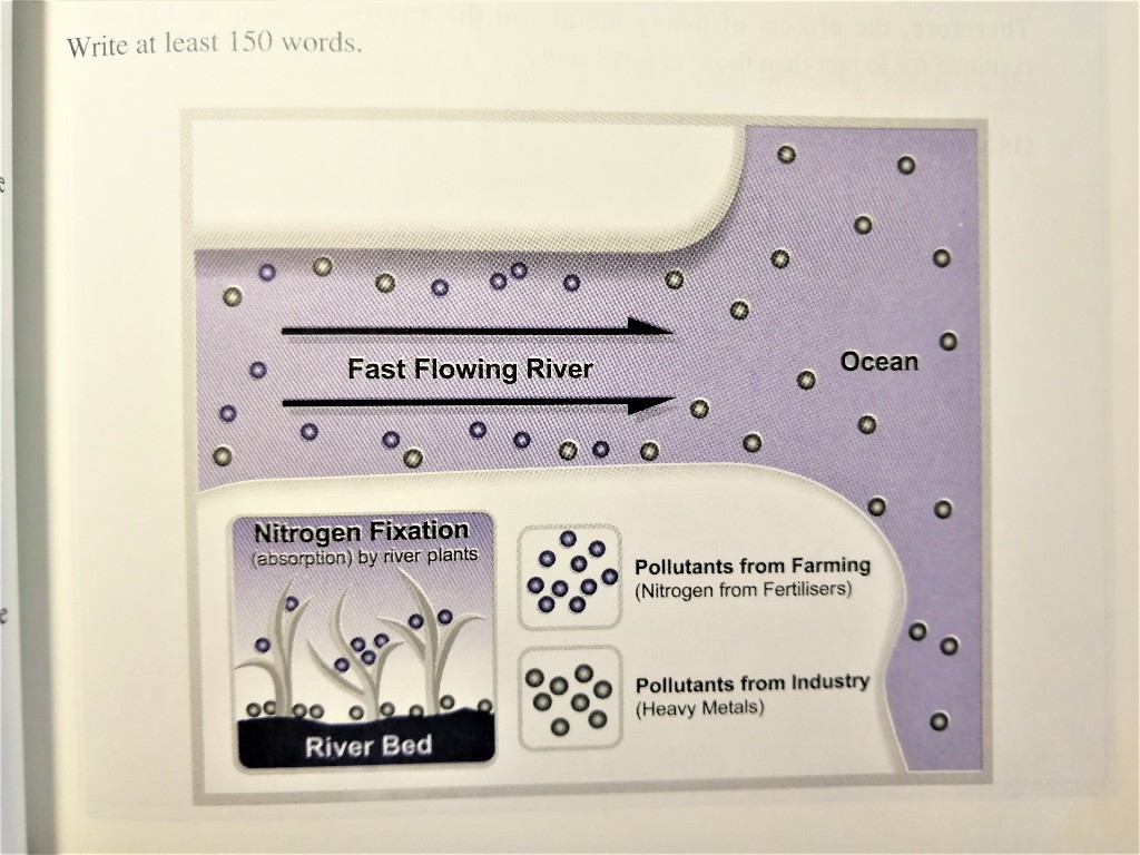
Given is a diagram illustrating the interaction between two types of pollutants - namely fertilisers from farming and havy metals produced by industry - and the ecosystem of a fast flowing river. The fertilisers are denoted by blue spots, while the heavy metals are marked as black spots.
From the information supplied, it is evident that fertilisers are more readily removed from the water through natural processes than heavy metals, and that the latter tend to remain in a river system for much longer periods of time. In the lower section of the diagram, plants growing on the river bed are shown to absord fertilisers from the water through a process known as nitrogen fixation. By contrast, heavy metals are not filtered from the river system in this way and instead either settle on the bottom or are emptied into the sea.
Thus, it is reasonable to surmise that the effect of heavy metals on the environment is longer lasting than that of fertilisers.
From the above we can learn:
We are supposed to pay attention not only to text but colors, shapes and changes in the diagram. Then we need to reasonably infer what it want to express, such as the nature of a phenomenon or a scientific mechanism and so on.
- namely (= that is to say)
- readily (freely)
- surmise (different from conjecture, be based some insufficient evidence, have some basis)
9. Flow Chart (Mobile Phone Recycling)
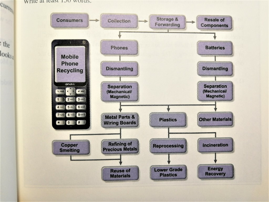
Giiven is a diagram illustrating the process by which mobile phones are recycled. It is evident from the information provided that there are three main phrases involved.
Prior to the actual processing of the phones, it is first necessary for the recycler to collect them from consumers. They are then either placed into storage or forwarded directly. At this point, the resale of certain components occurs.
The second stage of the recycling process, meanwhile, entails the seperation of the mobile phones from their batteries and the dismantling of both. Having further seperated the phones and batteries into mechanical and magetic parts, these parts are then divided into metals, plastics and other materials.
In the third and final phase, copper and precious metals are extracted from the metal components. The former is smelted while the latter are refined and the raw materials produced through these processes are subsequently reused. Meanwhile, plastic parts are either converted into lower grade plastic or incinerated to recover energy. The diagram does not indicate how other kinds of material are disposed of.
Remember the key to the flow chart is:
Divide the diagram into several stages/phrases/parts
10. Map (Planned Shopping Centre Locations)
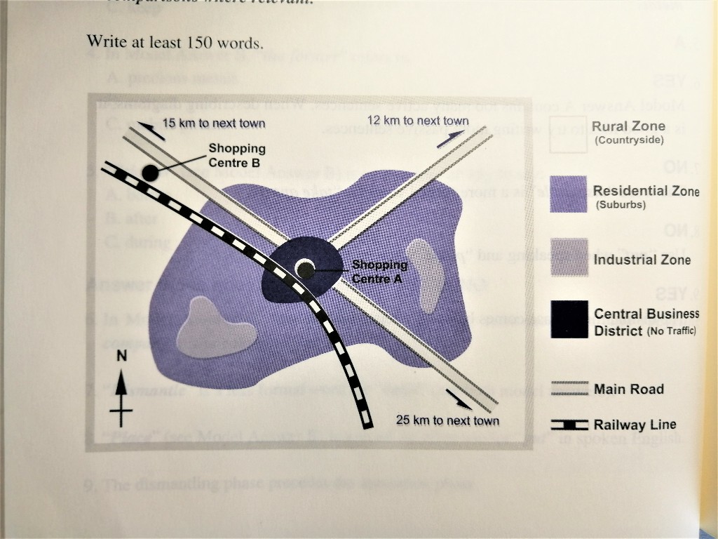
Given is a map of an unnamed town illustrating the probable sites of two new shopping centres in relation to various different zones as well as major transportation links.
As shown in the figure, the town has four main zones. Located at the apex of three arterial roads is a relatively small central business district. Cars are nor permitted in this area and all major roads terminate at its outer edge. Surrounding the town centre is a much larger residential zone which has within it two smaller industrial zones. Beyond this, meanwhile, is an even larger rural area. A railway line runs through the entire town from the northwest to the southeast.
With regard to the planned locations of the two new shopping centres, one is likely to be situated in the town centre and will be accessible by train or by parking on the edge of the central business district and walking. The other will probably be placed on the outskirts of the town to the northwest. Access to this shopping centre will be by either car or train as it will be situated between the railway line and the main northwest road.
本博客文章除特别声明外,均可自由转载与引用,转载请标注原文出处:http://www.yelbee.top/index.php/archives/89/

www.accioibis.com
Hello,
The article is very well written and the article is certainly very useful for IELTS writing and speaking. I would like to add an automatic IELTS writing and speaking grading tool, that will make the lives of students much easier.
For IELTS exam preparation, you can use AccioIbis. This application uses Artificial Intelligence and Machine Learning to evaluate IELTS writing and speaking scores in just SECONDS!. You don't have to wait anymore for the results.
Here is the link of the application - AccioIbis
Yaaaa,Aha ^_^