MSBD 5005 Data Visualization, BDT, HKUST
Start on October 11, 2019
Finish on December 16, 2019: Project Final Report PDF
Group Members: JIN Fenglei, LU Jinjing, YANG Rongfeng, ZHOU Wen
Abstract
Horse racing, as an long established sport event, enjoys great popularity among people in Hong Kong. Fans indulge in betting horse and predicting which horse will win in the race. However, it's unconvincing to predict by experience, intuition and little knowledge of previous data. Thus, we propose to use visualization technique to help people evaluate the winning probability of horses and be more sensitive to abnormal racing results. Our visual design follows these four tasks: which features to use, how horses perform, which abnormal results appear and how prediction result shows. Case studies are conducted to further demonstrate the usefulness of our visualization.
1 Introduction
Hong Kong horse racing is managed and run by the Hong Kong Jockey Club, whose simple and straight-forward betting pools include win, place, quinella, quinella place, etc. As a popular betting activity, how to predict and bet on horse racing has been a hot research topic.
In this project, we plan to visualize the horse racing data. This step is actually a process of data exploration. Its significance lies in improving our data sensitivity and mining out features that have an impact on the results, so as to facilitate feature selection, data processing and data prediction.
As for the dataset, we obtained the data from Sept. 2007 to Jan. 2019. There are 109085 rows (horses in matches) and 61 columns in the data, containing 8672 matches. We find several interesting features containing the horse rating, jockeys’ name, trainers’ name and odds. The multivariate and time series dataset gives us the chance to extract rating changes of horses, odds relationship and so on.
The structure of the report after the introduction is as follows:
- The second part introduces the related work based on which we conduct data processing and data visualization.
- The third part proposes the task content of the project.
- The fourth and fifth part are our visual design and case study respectively.
2 Related Work
Since we have not found a formal research based on data visualization of Hong Kong horse racing, there is no shoulder of giant for us to stand on. We plan to carefully follow the Information-Seeking Mantra proposed by Schneiderman : Overview first, zoom and filter, then details-on-demand.
For the visualization approaches, as heat map is suitable for display cluster patterns, we use it for feature correlation analysis for an overview. To focus more on the relationship and trend among features, by means of parallel coordinates planar ''graphs'' of multivariate relations are obtained. And since Sankey diagram are traditionally used to visualize the flow of energy or materials in various networks and processes, we use a variant bipartite graph of it to represent the relationship between jockeys and trainers. Finally, a sophisticated machine learning model is needed for winning probability prediction.
Utilizing the abundant amount of data produced every week in horse racing, few works have been published on the prediction of horse racing. Nonetheless, these few works, applying techniques ranging from multinomial logit regression to Support-Vector-Machines and to neural networks, have produced motivating results that makes horse racing prediction an attractive topic.
3 Task and Requirement Analysis
It is an interesting thing to learn Hong Kong horse racing culture. After combining both bettors' interests and our research purposes, we summarize four tasks as follows:
T1. Which features to use? Since we get a really massive dataset for horse racing, it is significant to extract the correlation among all features and to what extend they can influence the final results.
T2. How horses performed through the time line? Hong Kong Jockey Club would hold a horse racing once a week except public holiday and special cases. To analyse the racing statistics, the performance of horses comes at first. However, the performance of horses is a kind of time series data and we have millions of data from 2007 to 2019. Therefore, it is significant to give people an overview of the horses' performance through time.
T3. Is there any abnormal result in the race? Some horses performed well in the past but failed in the race. On the other hand, the horses with low rating and high odds were not likely to win, but might surprisingly become a DARK HORSE at last. Moreover, was there any combination of specific horse and jockey who always lost? These are the unusual circumstances we tend to explore.
T4. How to show prediction results and help people to bet? Our model outputs the prediction probability to be the wining horse for every horse in one race. Though it may be easy for human to find out the horse with higher probability, the winning probabilities of its competitors are also important. Since compared to probability rates, human are better at visual analytic, it is meaningful to visualize our results to help people discover the best horse at first glance and get a general impression of its competitors.
4 Visual Design
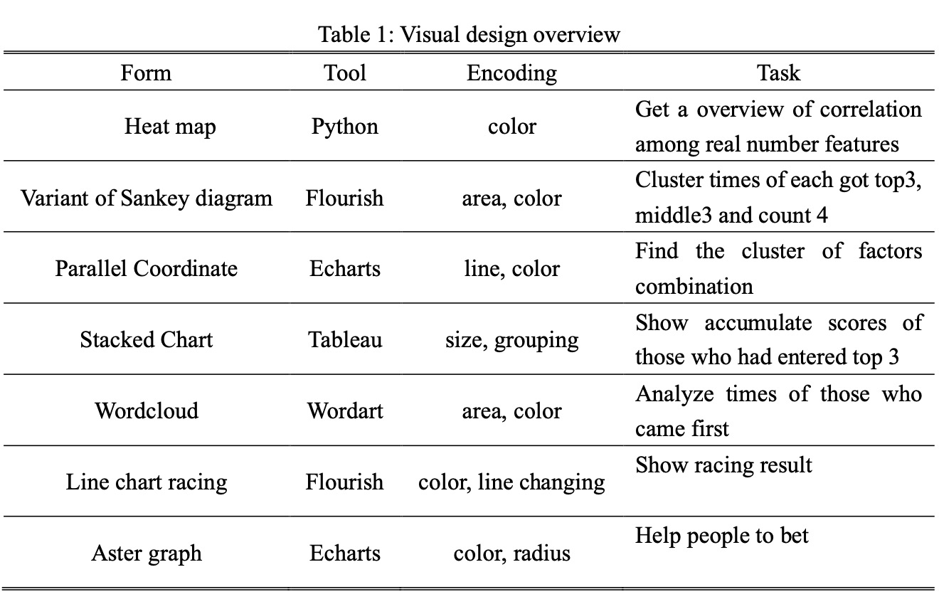
We propose to design several graphs to solve the tasks mentioned in Section 3. All our visual designs are summarized in the table. It includes what tools they use, how they are encoded and what tasks they do. We have used seven kinds of graph for visualization, including heat map, Sankey diagram, parallel coordinates, stacked bar chart, Wordcloud, line chart racing and Aster graph. Because of the high dimensional data of horse racing, heat map, parallel coordinates and Sankey diagram help to reduce dimensions and extract key features for further exploration. And bar chart, line chart racing and Aster graph, as efficient tools, are used to display the results in a clear way.
4.1 Design Rationale
Based on the task analysis, we propose the following three design rationales:
R1. Extract key features for prediction: To predict the horse racing results precisely, we need to filter out the some unrelated variables and extract the key features. Visualization techniques are used to help us identify which features are significant.
R2. Display results in an efficient way: The results of both T2 and T3 require to be displayed by visual technique following Tufte's Rule. We would carefully design marks and channels, encoding schemes and the interactive way to make visualization efficient. Our purpose is the visualization can help people make decisions on betting.
R3. Explore the meanings behind the data: Besides basic analysis above, we should mining the stories behind data. For example, collecting some abnormal performance in special occasion is a topic we can study.
4.2 Heat Map
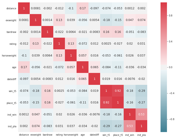
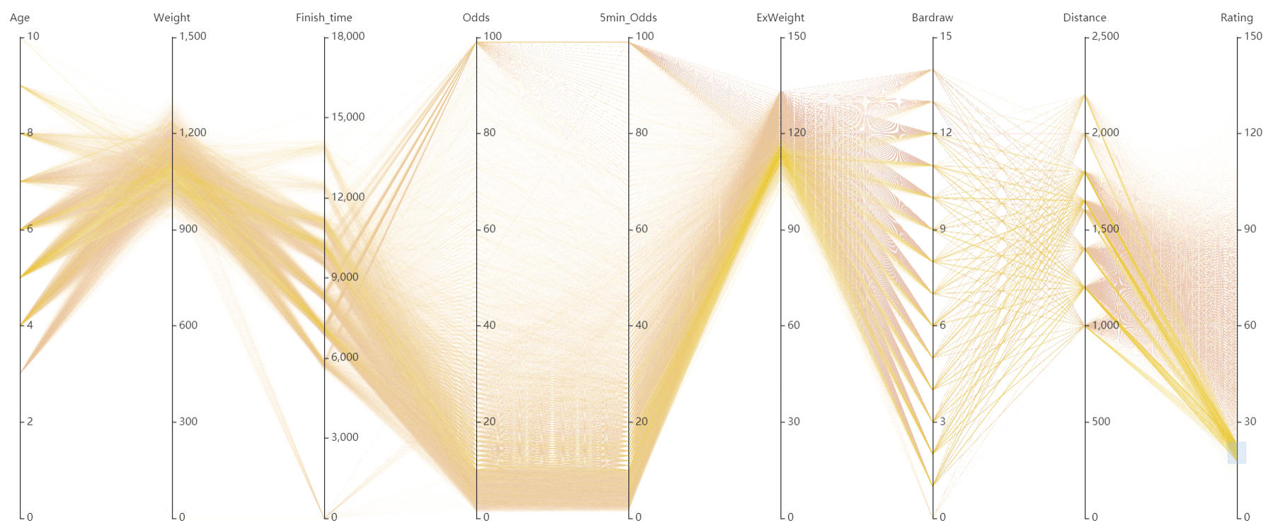
In order to identify and refine the key features for further exploration, we use correlation heat map to reflect the relation pattern between various features. We also adopt parallel coordinates to explore the relationship between the horse's age, horse's weight, finishing racing time, horse's odds and horse's rating.
A heat map is a graphical representation of data where the individual values contained in a matrix are represented as colors. Heat map is a newer term but shading matrices have existed for over a century. And for machine learning based feature engineering, correlation matrix is a simple and straightforward way to catch the relation pattern between different features, which is extremely suitable for heat map visualization. Since the correlation score is of range [-1.0, 1.0], where -1.0 means inverse ratio and 1.0 means direct ratio, we select two colors with high contrast for the color schema: red for positive value and blue for negative. Correlation scores are shown in each cell for further details.
4.3 A Variant of Sankey Diagram
To deeply explore the influence of jockey and trainer features on the results, we did a lot of visualization studies like the stacked bar chart, the word cloud and a variant of Sankey diagram. The significance of studying these two features lies in facilitating later processing of the text information of these two columns, such as adding appropriate dictionaries to these two columns before model processing.
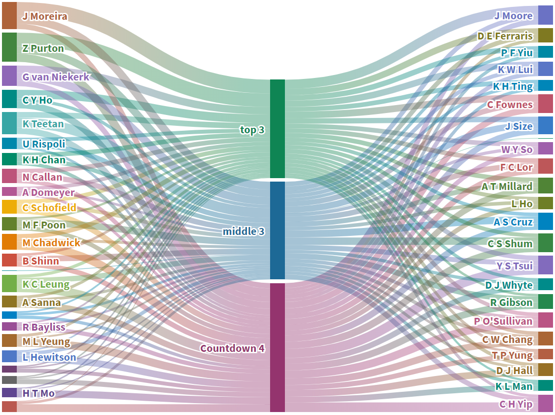
This part is the visual design of the variant of Sankey diagram, counting the times of each jockey and trainer gets top3, middle 3 and count 4. The left shows jockeys’ names and the right shows trainers’ names. We used different colors to represent different jockeys and trainers, and the width of each flow represents the times they got top3, middle 3 and count 4 respectively.
4.4 Parallel Coordinates
The parallel coordinates is a kind of multi-dimensions visualization technique where the features were placed as a sequence of parallel lines with scales. A point in n-dimensional space is represented as a polyline with vertices on the parallel axes; the position of the vertex on the $i^{th}$ axis corresponds to the $i^{th}$ coordinate of the point.
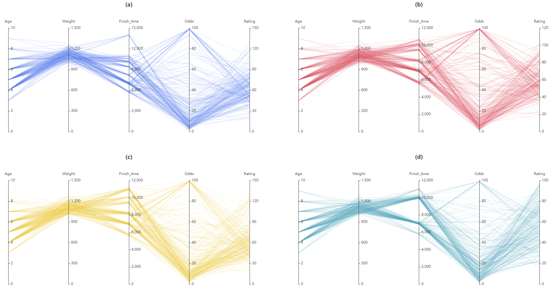
We have drawn four weeks data in four sub-figures. The horse age, weight, finish_time, odds and rating are encoded in five different dimensions which are placed as a sequence of five parallel axes with scales. The value of the feature in each dimension are mapped to the corresponding axis and each point are represented by a line. Generally speaking, we could clearly see these four sub-figures have roughly similar outlines which indicates horses have stable performance during four weeks. The odds are distributed at two ends and the majority are in the interval of 5% - 10%. Most of the horses in the race own ratings between 45 and 75. For clustering, It is obvious that the age and finish_time divide the data into several bundles. And different finish_time bundles correspond to different distance of racing.
When extending the period of time from 2015 to 2019, we add four extra features for analysing - five minutes odds, ex-weight, bar draw and distance. We filter the lines with high ratings which are represented by yellow while the pink lines are not selected. It's clear to find that the rating has high relationship with the odd. The higher the rating is, the lower the odd is. We also notice most of the good horses are distributed between 4 and 6 years old. To some extent, it shows that young horses have more potential to win in the race.
4.5 Stacked Bar Chart
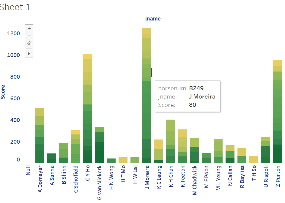
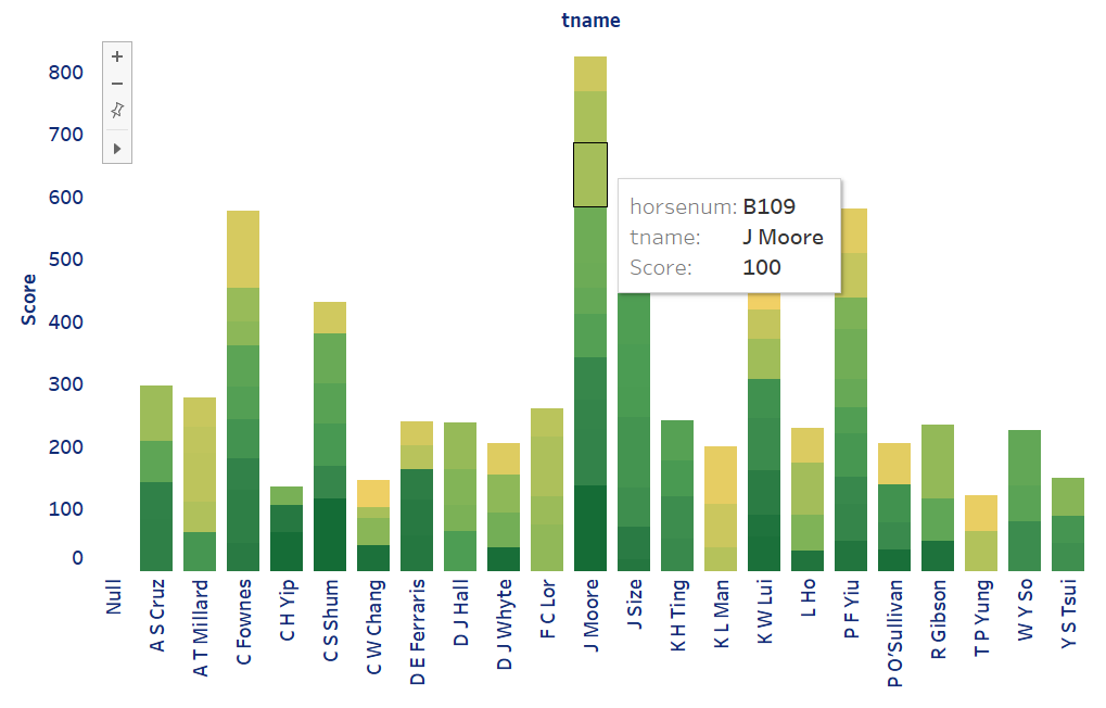
We use the data columns tname,jname and rating. We used Tableau to draw the chart, in which scale color of green is used to encode the score of each horse, size to encode scores, grouping to calculate the accumulated scores of their corresponding horses, where the score of each horse is calculated by its rating in the original data.
From the chart, it is fair to say that the level difference between different jockeys/trainers is huge in that accumulated scores of good jockeys/trainers may be many times higher than those of poor performance.
4.6 Wordcloud
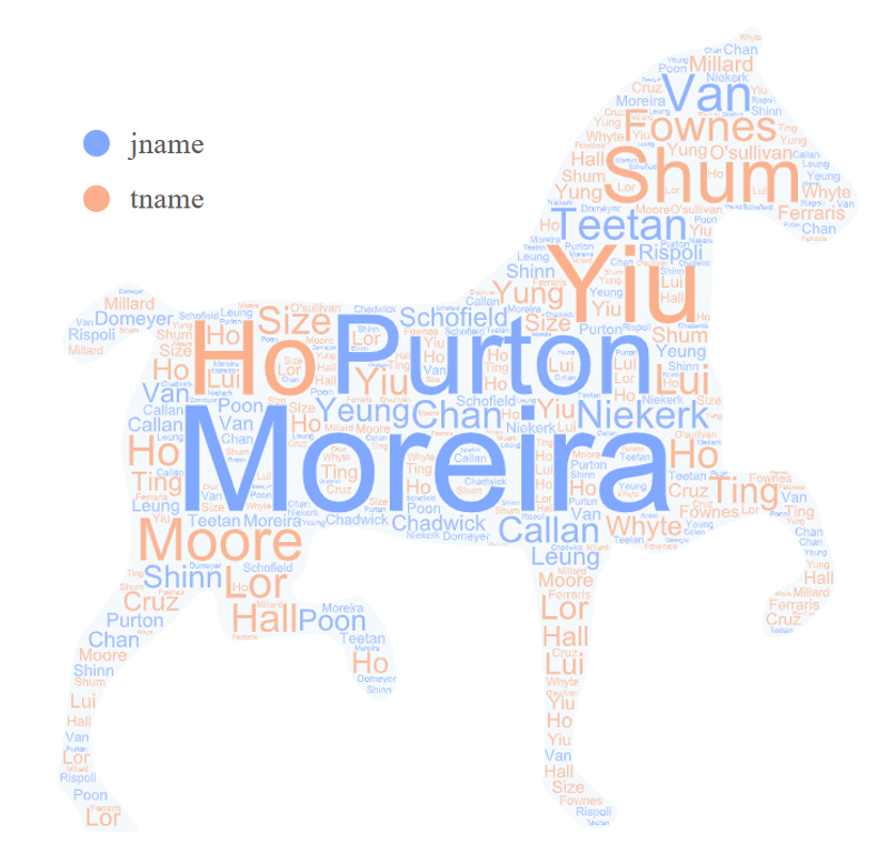
We use the same dataset but count the times of jockeys and trainers came first instead of scores. We used color to distinguish jockeys’ names between trainers’ names, where blue for jockeys and orange for trainers, and the size of area to visualize the times they won in all races.
From the word cloud, we can see that the sizes of jockey’s names are generally larger than trainers’ names. Also, combining with stacked bar chart and variant of Sankey Diagram, we can find that Moreira is the jockey who got the highest score, the most winning times and the most placing times, while the trainer who wins the most is not the same person who gets the highest score and the most placing times. Therefore, we can summarize that jockey has a greater influence on the result than trainer.
4.7 Line Chart Racing
As we all know, the ultimate goal of horse racing data visualization is to allow people in need to make reasonable bets. Line chart racing is designed to display the ratings of horses changing through time line. In this dynamic visualization, six horses that participated in eight identical races are selected and their ranking changes are intuitively visualized. We can see how these horses changed during these time periods. For example, horse C152, although it has won the first place twice, but it has changed a lot, and it is not the goal of those who pursue stable betting. The changes in these horse conditions bring a very intuitive visualization to those who want to bet. The line rating visualization is shown in the PPT.
4.8 Aster Graph
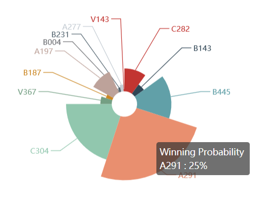
With the help of machine learning, we have obtained a prediction result by a sophisticated Random Forest model. The Aster graph is designed to show the winning probability of horses. To avoid confusing caused by size encoding, we use the radius to represents the win rate of horses in this race. The bigger the radius, the bigger the horse's chance of winning in this race. We can clearly see that Horse A291 has 25 percent win rate in the revolutionary competition, so we have a certain reason to bet on this horse. For those who want more specific data to make a bet, this graph is very helpful to them.
5 Case Study
In this section, we introduce our case study and show our analysing process in Overview first, zoom and filter, then the details-on-demand order.
It is not enough to just have visual design. Finding something interesting and hiding behind is more important. Therefore, our team has done the following case research problems:
- Outlier Detection: analyze the existed abnormal situation in a race.
- Classification: find the horses worth to bet on in a race.
5.1 Overview
According to heat map, we have to admit that all real number attributes cannot directly influence the final results by their own. By comparison the feature win_t5 (the winning odds of a horse 5 minutes before the race start) and pla_t5 (the placing odds of a horse 5 minutes before the race start) have a higher negative influence on the final result, which need to pay attention to when betting. It is obvious and reasonable that win_t5 and pla_t5 have a very positive relationship.
For categorical features, as many previous researchers mentioned, jockeys and trainers have a great influence on the result. From the Wordcloud chart, it is simple for us to find the excellent jockeys, who the best should be Moreira, following by Purton. And also for the Sankey Diagram, we analyze the quantitive performance for jockeys and trainers, which for jockeys, Moreira won top 3 most times and for trainers, Moore is good at training placing horses.
5.2 Zoom and Filter
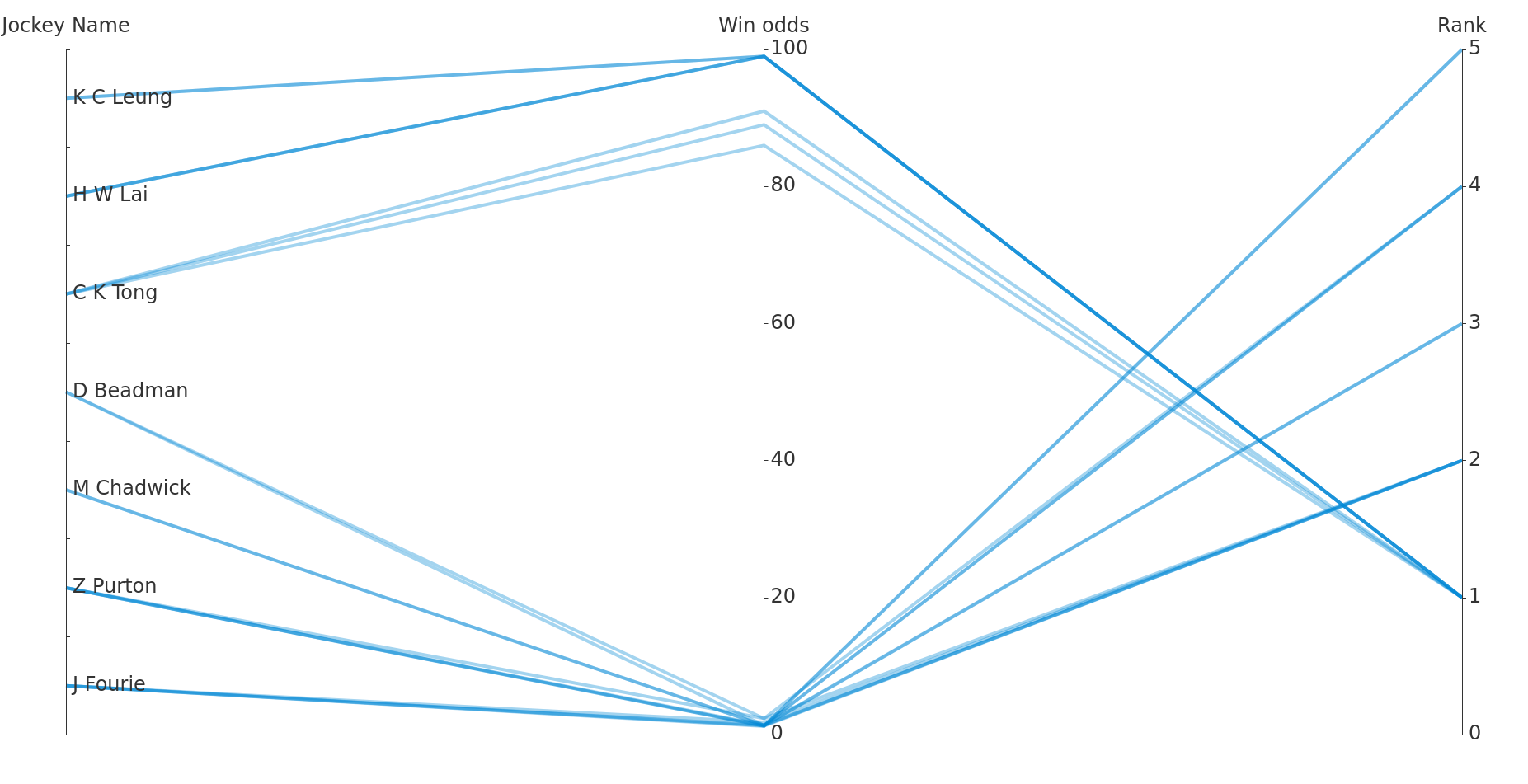
For Outlier Detection detection, we try to focus more on the influence of jockeys. We select two features: jockeys' name and win_odds, which is the key effective factor to the results and reflects the expectation of gamblers. And the final results are represented by the final rank of the jockeys with their horses. We define the rule of outlier as jockeys lost with low win odds (all think they would win, but they lost) and jockeys win with very high win odds (all think they would not win, but they won, which leads to extremely high profit if bet on them). Since the number of races is too large to analyze, we filter the win_t5 feature to below 2.5 or higher than 80. And the corresponding parallel coordinates graph is shown in the following graph.
For betting horse Classification, for new gamblers like us, who really care little about any other information about the ages of horses, the names of jockeys and other massive information, we only want a gold principle to help us bet our money and make profits. Therefore, we filter any other information but only shows the winning probability in the aster graph to help gamblers make decisions.
5.3 Details on Demand
We have already found the outlier jockeys in the parallel coordinate above. Tong, Lai, Wong, and Leung are so called miracle makers since they can win the first prize even though no one is believe in them. Not only once, they won with extremely high odds for several times. Therefore, when we watch their games in the future, even if their conditions are not that likely to win, you can bet some on them since they are good at to be dark horses witch can bring huge surprises. In the contrast, we name some jockeys like Fourie, Beadman, Purton, and Chadwick as disappointing jockeys since they failed to win with extremely low odds. Betting on them may not be a good choice since even though they win, you cannot get a lot of money, let alone they failed frequently.
For winning probability in the aster plot, we try to classify each horse in one race to two categories: worth to bet on and not worth to bet on. After long term testing, we find the best betting strategy: set a threshold (20% in our case), for horses which winning probability higher than the threshold bet the amount of money proportional to the winning probability. Therefore, the horses are classified into two categories.
6 Conclusion and Future Work
The above are the results of our visualization, visualization scheme and case analysis. According to our visualization, enough information has been brought to the viewers, and it also achieves the purpose of initially making reasonable bets for those in need based on these data. But these visualizations still have shortcomings. Our future work is to design an interactive window, integrate all the information, and bring the overall information to the viewers.
Acknowledgments
The authors wish to thank Dr. Huamin Qu for his advice on the visual design, classmates for their valuable and constructive comments, and finally every members in this group for their unremitting effort. This work was supported in part by the BDT program of HKUST.
Jin Fenglei was responsible for heatmap, aster graph and prediction result visualization. Lu Jinjing designed the sankey diagram, bar chart and wordcloud. Yang Rongfeng analyzed the relationship network of various factors and extracted features by drawing parallel coordinates. ZHOU Wen focused on horse rating visualization and she was responsible for line chart racing design. All roup members wrote final paper and designed PPT together.
